Great Indesign Work
Example
This is an example of great design on a page. In this picture we can see the photograph of the swimmer. This is a great photograph and we can see that the colours used in the photograph create a very psychedelic atmosphere. The page layout continues the atmosphere through their choice of title font and from the way that the text box is cropped to become parallel with the swimmer.

This is a great example of great design. We see the greyscale colour theme of the double page spread. We can also see the way the text effectively keeps to this colour theme while also managing to make the text to be visible on the black and white photograph.

Example
This is an ebook cover for the ebook Velvet Dogma. We can see the person on the front of the cover being splotched on a page like ink. The background is a white/pastel colour which resembles the colour of paper. The person on the front of the cover is also wearing black which matches the colour of the font.

Example
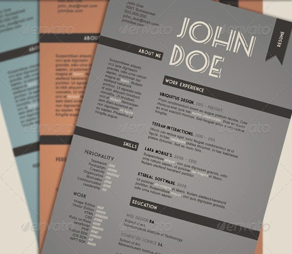
I like this design because I find the colour scheme very effective and eye-pleasing. The subheadings are quite effective as they break up the resume nicely. I also liked the the font used on the CV. I feel like this CV would be very effective on card yet not be as good on paper.
Example
I really like this example of the CV because I find the retro/vintage very eye pleasin and consistent. The logo and the charts allow this CV to look very new and innovative and also help demonstrate the aptitude of John Smith's design abilities.

No comments:
Post a Comment