Monday, 29 June 2015
Thursday, 25 June 2015
Production Log
PRODUCTION LOG
Lesson 1
In Lesson 1 I made a folder to put everything in. I then made the first document in the folio.

 First I made the logo for the magazine which I have already explained my development and workflow for in my design and planning post. I then inserted the picture of skepta which was going to be my contents page.
I then made the text buttons. These buttons directed the audience to every single page. I added the actual buttons at the end where I linked it to the pages I had already made and added to the folio.


 Then I made a new page to the right. I did this by creating a new document and inserting it into the folio. This page was the kendrick Lamar page. Again, I put a photo as the background. However, this picture wasn't big enough to fill the frame so I had to cut it up so the colour was consistent. I also put text onto the page. I then inserted a video.


Lesson 1
In Lesson 1 I made a folder to put everything in. I then made the first document in the folio.

 First I made the logo for the magazine which I have already explained my development and workflow for in my design and planning post. I then inserted the picture of skepta which was going to be my contents page.
I then made the text buttons. These buttons directed the audience to every single page. I added the actual buttons at the end where I linked it to the pages I had already made and added to the folio.


I did this by drawing a rectangle box with this tool. Then I then pasted the embed code for the video into the HTML box and then resized it.Then I made the next page below this one. I made it clear that there were pages there by inserting an arrow on the first page pointing downwards.

The page below this was focused on Tyler The Creator. I repeated what I did on the Kendrick Lamar page. I inserted a picture and resized it. I then inserted text and finally the video.

 Below this is the advertisement. I felt that this ad warranted it's own page as it is very relevant to the target audience of the magazine. I added a picture of the canon camera and then inserted text and a video advertising it. I felt that this was a good position to put an advertisement in as it wasn't a main feature so it didn't distract from the actual content but it was still easy to get to.
I then made another page and added it to the folio. I added a photo as the background of this
article and again added text and a video. I felt that if i did this with every article the magazine would be consistent. On this page I also added a Twitter widget by copying embed codes from twitter and inserting them into dreamweaver. I then changed the size until I was happy with it and then I inserted into Adobe Indesign. This was quite complicated and I felt I could have found a much easier way if I had looked further into it online.

I then made another page below this article where I put another article. I inserted a photo as the background image and added text and a video. I felt that if i did this with every article the magazine would be consistent.

 For the last page I added. I edited the photo of the artist in Adobe Photoshop. I then inserted it onto the page and added white text onto it. I played with the font and colour until I was happy with the design. I then inserted a video. This time however, I didn't insert an embed code but inserted the video manually from the hard drive.
Wednesday, 17 June 2015
Great Indesign Work
Example
This is an example of great design on a page. In this picture we can see the photograph of the swimmer. This is a great photograph and we can see that the colours used in the photograph create a very psychedelic atmosphere. The page layout continues the atmosphere through their choice of title font and from the way that the text box is cropped to become parallel with the swimmer.

This is a great example of great design. We see the greyscale colour theme of the double page spread. We can also see the way the text effectively keeps to this colour theme while also managing to make the text to be visible on the black and white photograph.

Example
This is an ebook cover for the ebook Velvet Dogma. We can see the person on the front of the cover being splotched on a page like ink. The background is a white/pastel colour which resembles the colour of paper. The person on the front of the cover is also wearing black which matches the colour of the font.

Example
I like this design because I find the colour scheme very effective and eye-pleasing. The subheadings are quite effective as they break up the resume nicely. I also liked the the font used on the CV. I feel like this CV would be very effective on card yet not be as good on paper.
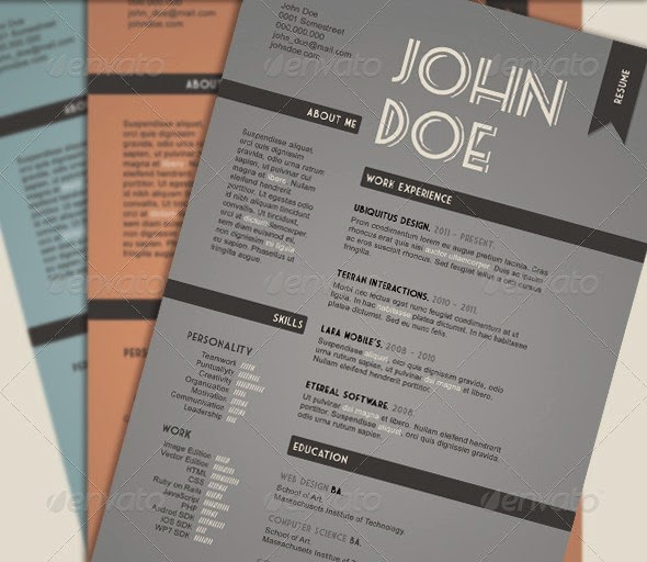
Example
I really like this example of the CV because I find the retro/vintage very eye pleasin and consistent. The logo and the charts allow this CV to look very new and innovative and also help demonstrate the aptitude of John Smith's design abilities.

TECH COMMENTARY
TECH COMMENTARY
1. Compression and file extensions (what does this mean?) – psd, ai. Indd, png, jpg, pdf. What are they, why do you use different extensions?
An example of a file type is a psd. which is what you save a Photoshop file as so you can easily work on it again using Adobe Photoshop. I saved this picture as a "psd." file while I edited this picture of Civil Ryan for my magazine. After I had finished editing the photo, I saved it as a "jpg." because it is a photo and jpg.'s are used as they retain the most quality but keep file sizes to a minimum.

2. Vector images (what does Vector mean?) - points, lines, curves, polygons. Explain what they are and how you use them.
A vector image is an image made up of paths, as opposed to pixels like JPEGs and GIFs. This means that the image can be made smaller or larger very easily unlike bitmap images which lose quality as the dimensions of the image are changed.
Here is a screenshot of me editing the logo for my magazine which I did on Adobe Illustrator which uses vector sourced images

3. Bitmap images (what does bitmap mean?) – image resolution, RGB, CMYK. What is the difference, why would you use one over the other?

4. Image capture – scanners, digital cameras, storage. What have you used and how did you do it?

5. Workflow and use of Software interface including Adobe Photoshop, Adobe Illustrator and Adobe InDesign - demonstrate how you create work in different packages and move through the different software packages.
I started developing the logo and used mine as an inspiration. We see me editing it in Adobe Illustrator.

I then went and copied the logo style but changed the name for the name of the magazine. I used the same font and then put a similar style box around it


 I then made another sub-logo for my logo and then saved them both as PNGs so the background would be transparent and then put them onto the front cover
6. Asset management – file formats, file naming conventions, saving. Demonstrate how you manage and organise your assets throughout the design process.
7. Folio Builder, Adobe Content Viewer and sharing - demonstrate how these work and how you have used them.
I used the folio builder to put my magazine together and to be able to navigate through it.
We can see here that while on the first page, labelled contents, is on the contents page.


The first article on the last page is about MF DOOM. You can then scroll down to look at the last articles in the magazine.

Thursday, 4 June 2015
Design and Planning-Magazine
Design
LOGO DEVELOPMENT
When I first made my music video I knew I wanted to use the font Baron Neue because I had used it before in my own logo and knew it would look good with a thin box around it.
However, I wasn't sure about the name of the magazine. Here is part of my development in the naming and finally coming up with the final logo for the magazine.


MOODBOARD/BRAINSTORMING

 My second idea was to do a music video themed magazine. I thought that this idea was much better as there would be a much larger range of things I could do with. For example, the colours, design style,
 articles etc.
This mood board shows a selection of screenshots of visually interesting music video. It also includes some camera equipment as there will be an advert advertising a camera as this will interest the target audience.
 My first brainstorm (right) was used decide what the topic and aesthetics of my magazine would be. It is in this brainstorm where I decided that I would focus my magazine on music videos.
In my second brainstorm I looked at the features of my music-video themed magazine. In this one I looked at aesthetics more in depth and the kind of music and artists that would feature in the magazine.

Thursday, 22 January 2015
Assignment 1:Task 1
Assignment 1: Task 1
Follow the links to access the files.
- https://docs.google.com/document/d/17LNFrr2qPzDLZjm244Cy4Q2k6DjhC3tXwjMEBYd1twc/edit?usp=sharing
- https://docs.google.com/document/d/1oKg776VCOIx2e1Z7qIeRT-Rl8oXhOp0bhiyx3tvQSsQ/edit?usp=sharing
- https://docs.google.com/document/d/1vle6KqBsYdNwpcffZ-Q7KC-ISxxRnYtq4uy9ZmFnEyI/edit?usp=sharing
- https://docs.google.com/document/d/1510cuigF1o1bOm2PZ1qOKljpzxpkgIV7dTZHGUokmPA/edit?usp=sharing
Subscribe to:
Posts (Atom)